Walk into a beautifully furnished room that still feels strangely uncomfortable, and the culprit is usually on the walls. Paint covers more surface than anything else in your home, so a wrong colour choice never sits quietly in the background — it sets the emotional temperature of the entire space.
Interior designers hear the same regrets on repeat: a living room that feels like an operating theatre, a bedroom that buzzes with restless energy, a hallway that seems to swallow all the daylight. Before you pick up a roller, here are the shades the experts say to think twice about — along with the calmer alternatives they recommend instead. This guide rounds up the paint colors to avoid, according to working interior designers, and pairs each one with a safer swap.
1. Stark, Clinical Whites
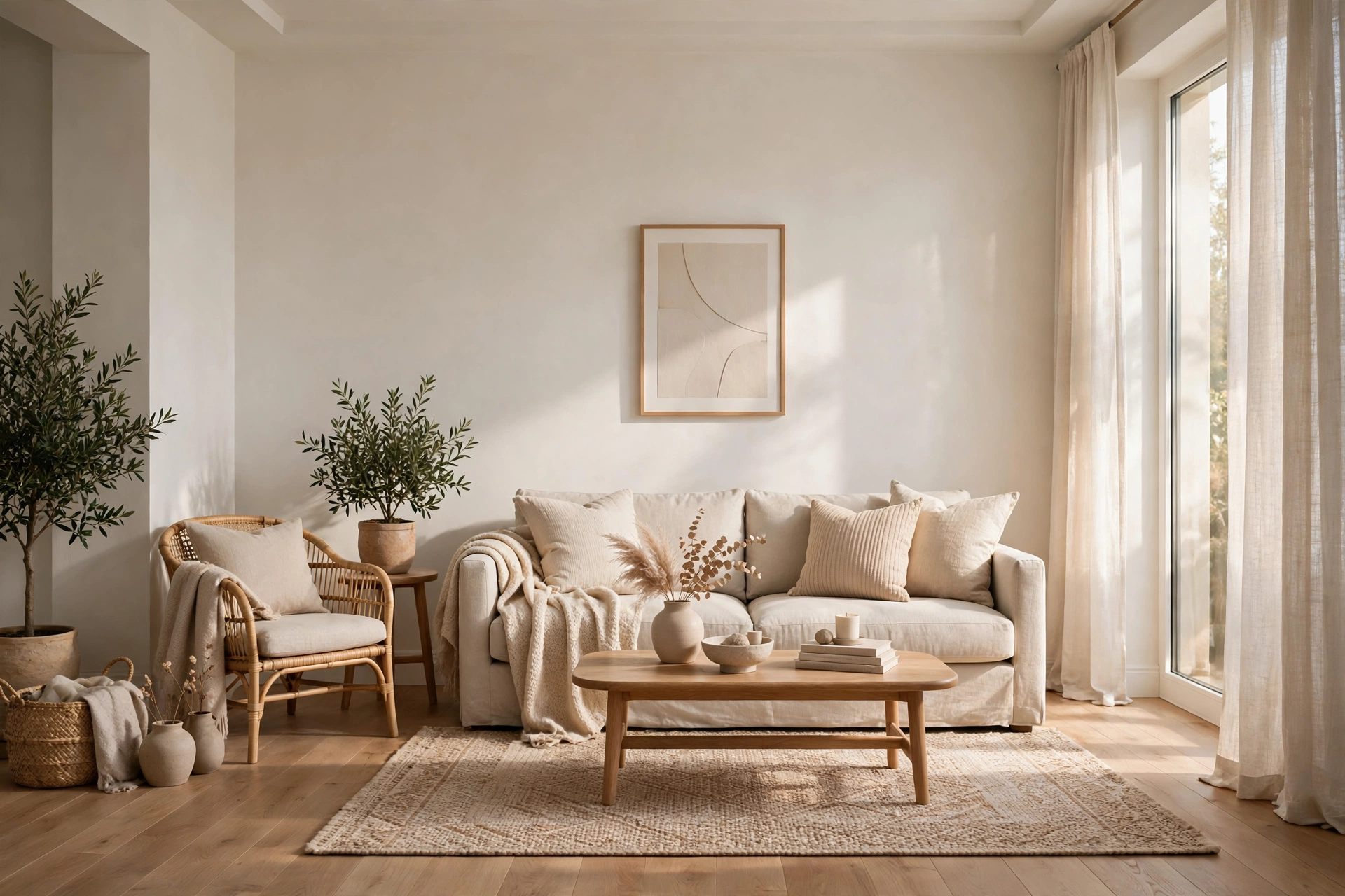
White feels like the safe choice, but a brilliant blue-white can read cold and sterile under everyday lighting, especially in rooms with little natural sun. Instead of airy, the result is often closer to a waiting room. Choose a warm white instead — ivory, soft chalk or alabaster tones with a whisper of cream bring the same brightness without the chill, and they flatter wood furniture and skin tones beautifully. Of all the paint colors to avoid, a clinical bright white is the most common regret designers hear about.
2. Neon and Electric Brights
Hot pink, electric yellow and acid green might look thrilling on a tiny swatch, but on four full walls they vibrate. These high-voltage shades overstimulate the eyes and make it genuinely hard to relax, which is why they rarely survive long in real homes. If you love vivid colour, reach for muted pastels or dusty versions of the same hues — a soft coral or a gentle butter yellow gives you the personality without the headache. Neon brights top most designers’ lists of paint colors to avoid in bedrooms and living rooms.
3. Loud Orange and Lime Green
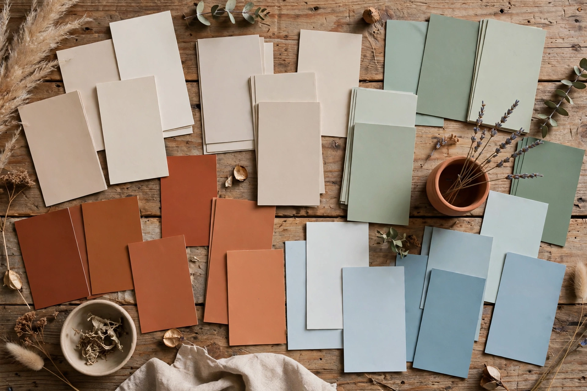
Bold orange can feel aggressive rather than energising once it wraps a whole room, and lime green has an unfortunate habit of glowing under artificial light, casting a sickly tint over everything in it. Both shades fight with most furniture and fade badly in strong sunlight. Warmer, earthier relatives work far better: terracotta brings all the warmth of orange with none of the shout, while a sandy warm beige or soft oat tone does everything lime green promises — freshness, lightness — without the glow.
4. Heavy Browns and Oppressive Darks
Deep chocolate brown or near-black walls can look dramatic in a photograph, but in daily life they absorb light and make average-sized rooms feel smaller and heavier. Dark colours also show every scuff and dust mark. You do not have to give up depth entirely, though — warm greys and greige tones deliver that cocooning feeling while keeping the room breathable. And if your heart is set on something truly dark, limit it to one accent wall or a piece of furniture rather than the whole room. Very dark hues are not always paint colors to avoid — they can work beautifully as an accent — but coating all four walls is where the regret usually starts.
5. Fire-Engine Red
Red is the colour of appetite and adrenaline, which is exactly the problem. Studies on colour psychology have long linked strong reds with raised heart rates and restlessness — fine for a restaurant, exhausting for a bedroom or home office. It also dominates everything around it, so your furniture ends up competing with the walls. Earthy greens like sage or olive offer a far calmer kind of richness: still full of character, but the kind that lets you unwind.
6. Icy Blues and Mint
Icy blue and mint look crisp and refreshing on a paint chip, yet in real rooms — especially ones facing away from the sun — they can feel clinical and chilly rather than calming. The cool undertones amplify grey daylight and make a space feel emotionally distant. A soft, powdery blue or a blue-grey with warm undertones keeps the serenity of blue while staying welcoming, and it pairs effortlessly with natural materials like linen, oak and wool. Icy blues join the paint colors to avoid in north-facing rooms, where cool daylight makes them feel even chillier.
7. Ultra-Trendy “It” Colours
Every few years a new hero shade takes over — one season it is peach everything, the next it is a hyper-saturated jewel tone plastered across every wall. The trouble is that trend colours date fast, and repainting an entire house every two years is nobody’s idea of fun. Timeless neutrals age gracefully, so let them do the heavy lifting and bring trends in through cushions, art and accessories. A deep teal or mustard accent, for example, adds that fashionable edge and can be swapped out cheaply — a trick any list of budget-friendly home decor tips will confirm. Ultra-trendy shades are the paint colors to avoid if you repaint as rarely as most homeowners do.
8. The Same Colour in Every Room
Painting the entire house one shade feels efficient, but it flattens your home’s personality. Light changes from room to room, so a colour that sings in a sunny kitchen can fall flat in a north-facing bedroom — and a single-note scheme starts to feel monotonous fast. Build a varied palette from the same colour family instead, letting each room have its own mood while everything still flows together. It is one of the classic interior design mistakes that is easy to fix before the first tin is even opened.
Bonus: The Fast-Food Test
Here is the designers’ favourite gut check. Stand back and look at your planned palette: if it resembles a fast-food logo — red plus yellow plus orange — it is engineered to stimulate appetite and urgency, not rest. That is a brilliant scheme for a burger joint and a terrible one for anywhere you want to feel calm. When in doubt, swap one of the hot shades for a neutral and watch the whole scheme settle.
None of this means colour is the enemy — far from it. The happiest rooms almost always have confident colour choices; they are simply choices made with the room’s purpose in mind. Test large sample boards on the wall, live with them for a few days, and check them in morning and evening light before committing. Knowing the paint colors to avoid is only half the job; testing the keepers in your own light is the other half. And once the walls are right, a few small home organization ideas will help the whole room breathe.
Frequently Asked Questions
What is the worst paint colour for a small bedroom?
Among the paint colors to avoid in a small bedroom, strong stimulating shades are the biggest offenders — neon brights, fire-engine red and loud orange all fight against rest. In a small bedroom, pale warm neutrals or soft muted greens work best because they recede visually and let the room feel larger and calmer.
How can I test a paint colour before committing?
Paint large sample boards or sheets of card rather than dabbing the wall directly, then move them around the room and observe them at different times of day. A colour that looks perfect at noon can turn cold or garish under evening lamplight, so give it at least two full days.
I have already painted a “bad” colour. Do I have to repaint?
Not necessarily. You can soften an overpowering wall with large-scale art, warm textiles, layered lighting and plenty of natural materials, which all dilute the colour’s impact. If it is still too much, remember it is one of those paint colors to avoid keeping — repainting just one or two walls and keeping the boldest shade as an accent often solves the problem.